BASA
Project details
About the project
At Jarcore Studio, we had the privilege of collaborating with BASA, Eroateko Janaria – Take Away, a specialized takeout food company, to create a logo and branding that would make their proposal stand out in the competitive culinary market. Our goal was to capture our client’s essence and convey it through a visually appealing and meaningful design.
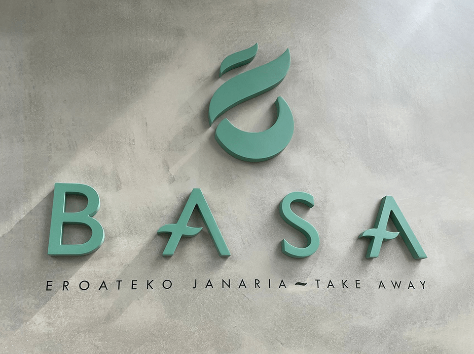
The logo we created for BASA combines simplicity and meaning in a single image. We placed the company name in the center, using a carefully selected typography to ensure impeccable readability. We wanted the name to leave a lasting impression on customers, conveying professionalism and modernity.
As a visual support, we decided to include a distinctive symbol: a flame. We designed this element specifically for BASA, representing the passion and unique flavor of their takeout meals. The flame symbolizes the warmth, energy, and satisfaction that customers experience when enjoying BASA’s products. With this symbol, we created a focal point that generates an immediate association with the brand, establishing an emotional connection with consumers.
Color
Furthermore, we carefully selected the color for the logo. We opted for a soft teal green tone. This color conveys freshness and tranquility, reminding us of the green hues found in natural landscapes like forests and meadows. By softening the green with a touch of blue, we achieved a more muted and relaxing appearance. This tone evokes a sense of serenity and nature, adding a touch of calmness and harmony to the logo design.
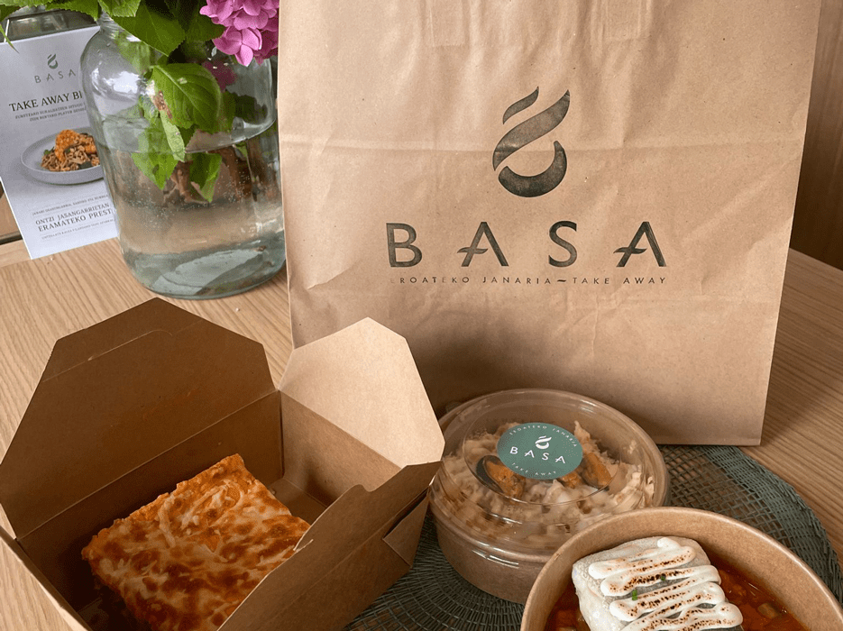
At Jarcore Studio, we didn’t limit ourselves to just the logo; we also encompassed the entire branding for BASA. We maintained a consistent aesthetic across all visual aspects: menus, packaging, and online presence for BASA. This coherence was crucial in creating a strong and recognizable brand identity, helping BASA stand out in a competitive market.
We are proud to have collaborated with BASA in creating exceptional logo and branding. The logo captures BASA’s essence and culinary offerings with its name and flame symbol. The readability of the typography used ensures that the brand is easily identifiable, while the soft teal green color conveys freshness, tranquility, and a connection with nature. Collectively, our branding work has created a strong and consistent visual identity across all touchpoints, reinforcing BASA’s presence in the competitive takeout food market. It was an exciting project, and we are delighted to have been part of BASA’s transformation.


